ABHINAV VATS
UI/UX Designer + Frontend Developer · Issue 01 · 2026
1

ABHINAV VATS

UI/UX DESIGNER + FRONTEND DEVELOPER

I design digital products and build the interfaces behind them.

Built 50+ reusable components.
Engineered design tokens, an
absolute genius 3

Working with Abhinav was on
my bucket-list for a long time..
Glad it was possible 2
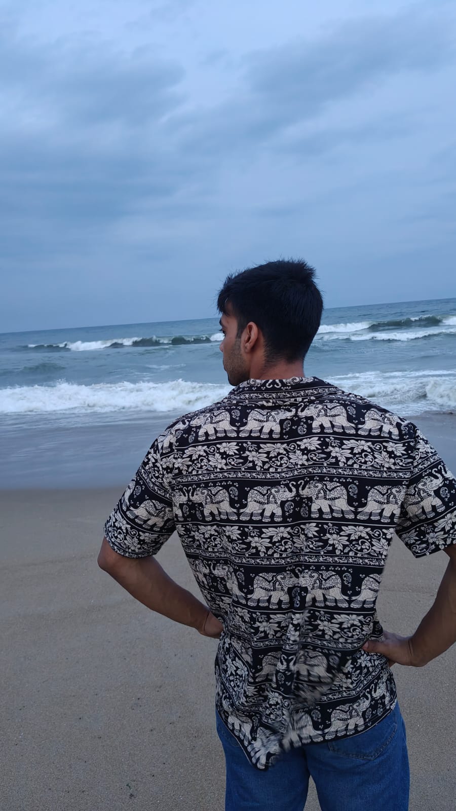
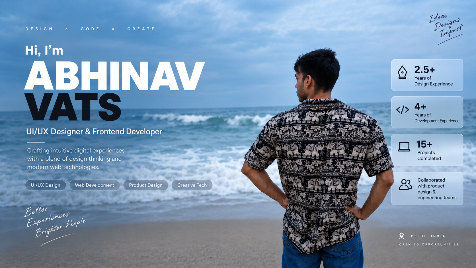
Abhinav at the beach

"We don't fully understand his
process. But it works." -
Looping Loons team 2

Building a Scalable UI System (50+ Components)

Looping Loons · UI/UX Frontend Developer

Designed and shipped user-facing interfaces for an AI-driven platform. Translated product requirements into a robust design system and developed over 50 reusable React components, improving UI consistency across the platform.

Selected Case Studies

3 PROJECTS · UX & PRODUCT DESIGN
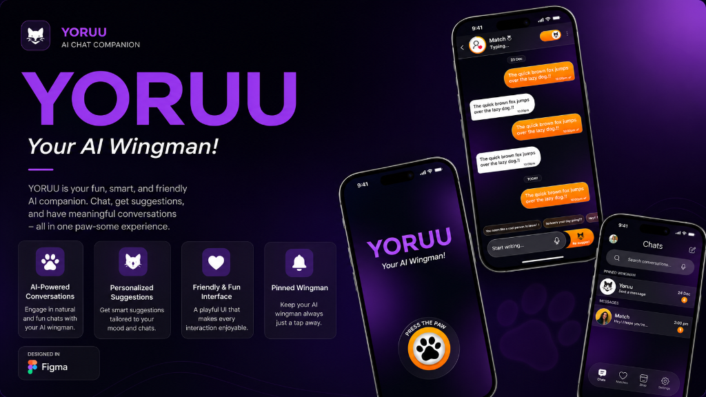
Yoruu AI Wingman App
View Prototype ↗

Yoruu: AI Chat Companion & Matchmaking App

An AI-based chat application designed to match users for dates through intelligent conversation, smart recommendations, and interactive AI companions.
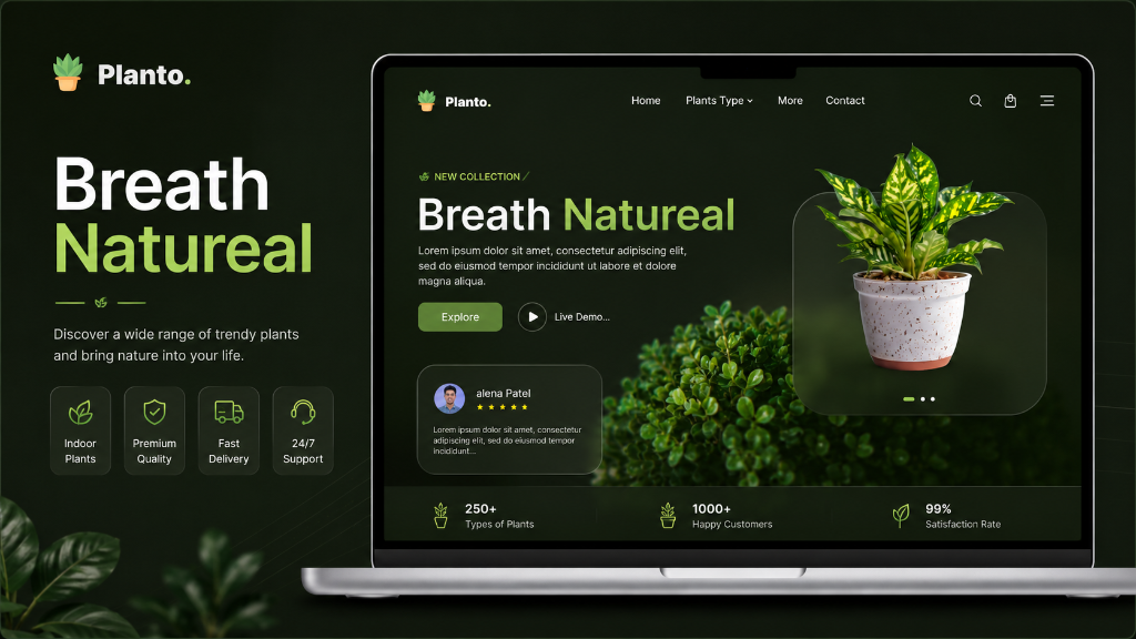
Planto Landing Page
View Prototype ↗

Planto: Corporate Eco-Solutions

An e-commerce landing page connecting corporate clients with indoor plant setups.
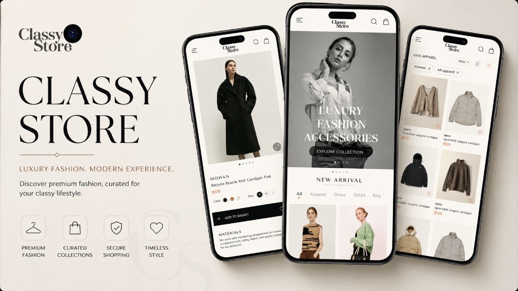
Classy Fashion Storefront
View Prototype ↗

Classy Fashion

A modern apparel e-commerce experience optimized for seamless product discovery.

PROFESSIONAL EXPERIENCE CASE STUDY · DESIGN SYSTEMS

Building a Scalable UI System

Engineered a comprehensive design system and translated it into 50+ reusable React components to accelerate feature delivery for an AI-driven platform.

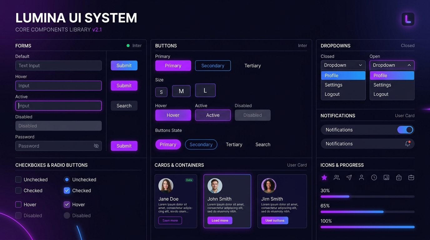
Component Library Overview

The Context & Problem

Before this system, every new feature meant rebuilding the same UI elements. We needed a single source of truth connecting Figma to React.

Looping Loons is an AI-driven platform. As the product grew, UI inconsistency became a major bottleneck. The engineering team was spending excessive time rebuilding buttons, inputs, and layout grids from scratch for every sprint. Feature delivery was slow, and visual regressions were common.

The challenge was not just to design a beautiful interface, but to architect a highly structured system of design tokens and components that could be predictably implemented in code.

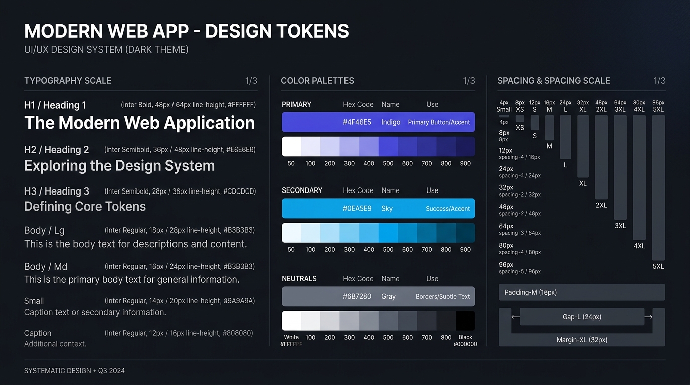
Design Tokens (The Foundation)

Before touching components, I established the foundational design tokens. This ensured that typography scales, spacing increments, and color palettes were mathematically sound and easily consumable by frontend engineers.

Design Tokens Snippet

Component Architecture

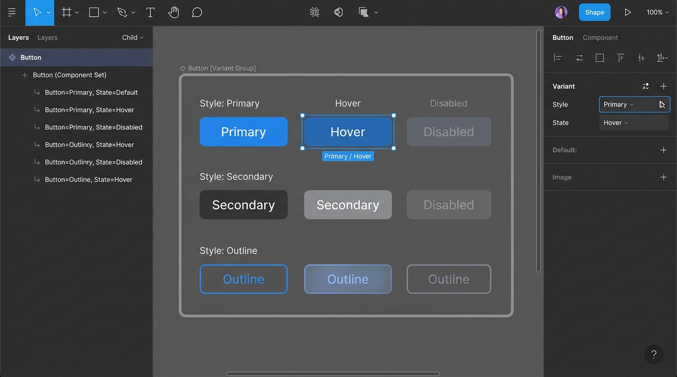
I systematically built over 50 components—ranging from atomic elements like buttons and badges to complex organisms like data tables and navigation structures. Each component was built with Auto-Layout in Figma, accounting for responsive behavior across breakpoints and ensuring strict accessibility contrast standards.

Figma Component Variants

Figma to React Pipeline

Because I straddle both design and development, my workflow didn't stop at Figma. I translated these design tokens and UI components directly into reusable, typed React components. By implementing code splitting and lazy loading where necessary, the UI library remained highly performant (yielding 95+ Lighthouse scores).

import { ButtonProps } from './types';
import './Button.css';

export const Button = ({ variant = 'primary', size = 'md', children, ...props }: ButtonProps) => {
  const className = `btn btn-${variant} btn-${size}`;
  
  return (
    <button className={className} {...props}>
      {children}
    </button>
  );
};

The Outcome

40% Reduction in Feature Delivery Time: By providing the engineering team with a plug-and-play component library, we eliminated the redundant work of rebuilding UI primitives.

Guaranteed UI Consistency: The gap between design and production was closed. Developers no longer had to guess spacing or hex codes, and product managers saw exactly what was designed translated perfectly into the live build.

AI DATING & MATCHMAKING PROJECT 01 / 03 · FEATURE STORY

Yoruu

An AI-based chat companion designed to match users for dates through intelligent conversation, smart recommendations, and interactive AI companions.

Yoruu UI

The Story

P.02

Yoruu is a mobile dating application built around the concept of AI-driven matchmaking. Instead of relying on traditional swiping mechanics, Yoruu introduces an AI chat companion called "Your AI Wingman" that helps users find compatible matches through conversation-based interaction.

The design challenge centered on creating a dark-mode interface that felt approachable and playful while maintaining the sophistication expected from a dating platform. The purple and orange accent palette was chosen to convey warmth and energy within a dark environment.

The Problem

P.03
User retention in traditional dating apps drops sharply due to "swiping fatigue." How do we design a platform where conversation and connection happen before the superficial swipe?

Through competitor analysis, I identified that the primary churn factor in modern dating apps is not a lack of users, but a lack of meaningful interaction. Users swipe endlessly but rarely converse. The core business and user problem was clear: We needed to architect a discovery mechanism that forced interaction without feeling like work. The proposed solution was an AI-facilitated conversational interface.

Constraints & Assumptions

P.04

Assumption: Users are willing to talk to an AI "wingman" before being introduced to a real human.

Constraint (Trust): The AI interface could not feel "uncanny" or overly robotic. It needed to build trust rapidly.

Constraint (Cognitive Load): Typing is higher friction than swiping. The interface needed smart prompts to reduce the effort of starting a conversation.

UX Strategy

P.05

Instead of a card stack, the home screen is a chat interface. By shifting the mental model from "catalog browsing" to "active conversation," I aimed to increase the baseline investment a user makes during onboarding. The AI asks profiling questions naturally, removing the need for a tedious 10-step form.

Design Decisions & Trade-offs

P.06

Why Dark Mode? Dating apps are predominantly used in the evening. While dark mode reduces eye strain, it introduced severe contrast challenges. I had to carefully calibrate the purple and orange accents to meet WCAG AA standards, ensuring readability wasn't sacrificed for aesthetics.

The Paw-Print CTA: To avoid the clinical feel of a standard "Submit" button, I designed a signature interaction button. The trade-off was a slight reduction in immediate affordance (some users didn't recognize it as a button initially), which was mitigated by adding subtle pulse animations.

User Flow

P.07
1
Onboarding
2
AI Chat
3
Match Suggestion
4
Chat with Match
5
Date Planning

Final Design

P.08
Yoruu Final Designs

Fig. 1 — The Yoruu interface featuring dark-mode chat screens, AI wingman interaction, and match profiles.

❖ Live Figma Prototype Open in Figma ↗

Validation & Usability Insights

P.10

Prototype Testing

Tested the high-fidelity Figma prototype with 5 target users to validate the chat-first onboarding hypothesis.

Key Insight 1

Users were highly engaged by the AI prompts, but required more transparency on how the AI's questions influenced their algorithm matches.

Key Insight 2

The "Paw-Print" CTA pulse animation successfully bridged the affordance gap, resulting in a 100% completion rate for the initial onboarding flow in testing.

Next Steps

Iterate on the AI "typing" states to manage user patience, and build a secondary light-mode theme for daytime accessibility.

B2B PLANT & ECO-SOLUTIONS PROJECT 02 / 03 · FEATURE STORY

Planto

An e-commerce landing page connecting corporate clients and office spaces with oxygen-rich indoor and outdoor plant setups directly from local suppliers.

Planto UI

The Story

P.02

Planto addresses the growing corporate demand for green office environments. The landing page is designed to immediately communicate the value of indoor plants for workplace wellness while providing a clear path to product exploration and supplier connection.

The design language draws from nature — deep greens, organic shapes, and generous whitespace that mirrors the calm, restorative quality of the plants being sold. The layout prioritizes trust signals and visual impact over aggressive conversion tactics.

The Problem

P.03
Corporate buyers struggle to visualize plants in their specific office layouts, leading to high cart abandonment. We needed to bridge the gap between inspiration and procurement.

The primary challenge was not just selling plants, but designing a B2B conversion funnel. Corporate facility managers were visiting generic nursery sites but failing to convert because they couldn't confidently visualize scale, maintenance requirements, or architectural fit. Planto needed to serve as both an inspirational mood board and a frictionless procurement portal.

Information Architecture

P.04

1. Contextual Visualization: Large botanical photography dominates the above-the-fold experience, but strictly shows plants *in office contexts*, not just isolated pots. This immediately answers the buyer's subconscious question: "Will this work in my space?"

2. Trust Signals Above the Fold: Clean statistics (250+ types, 1000+ happy customers) are presented immediately. B2B buyers require social proof before exploring catalogs.

3. Scalable Navigation: The product categories are grouped by architectural need (e.g., "Desk Setup", "Lobby Statement Pieces") rather than botanical genus, aligning the IA with the buyer's mental model.

Designing for Conversion

P.05

The "Get a Quote" Flow: Recognizing that corporate purchases often require invoice generation rather than direct credit card checkouts, I prioritized a "Request Corporate Quote" CTA hierarchy alongside standard add-to-cart patterns.

Visual Restraint: The UI acts as a subtle frame. Deep greens and generous whitespace mirror the restorative quality of the products, deliberately avoiding aggressive "Buy Now" red buttons that would compromise the premium brand positioning.

Final Design

P.08
Planto Final Design

Fig. 1 — The Planto landing page featuring contextual photography, trust metrics, and B2B-focused product exploration.

❖ Live Figma Prototype Open in Figma ↗

Validation & Usability Insights

P.10

Concept Validation

Tested the landing page prototype with 4 office managers to evaluate trust and navigation clarity.

Key Insight 1

Categorizing plants by "Office Location" (Desk, Floor, Hanging) outperformed traditional botanical categories in task-completion speed by roughly 40%.

Key Insight 2

Users actively sought out maintenance data (watering frequency, light needs) before adding to cart, prompting a redesign of the product cards to surface these specs earlier.

Next Steps

Design the corresponding dashboard for facility managers to track plant health and schedule maintenance visits.

LUXURY APPAREL & E-COMMERCE PROJECT 03 / 03 · FEATURE STORY

Classy Fashion

A modern apparel e-commerce experience optimized for seamless product discovery, apparel filtering, and high-converting fashion shopping.

Classy Fashion UI

The Story

P.02

Classy Fashion is a mobile-first luxury apparel storefront designed to bring the editorial quality of fashion magazines into a functional e-commerce experience. The interface combines high-fashion photography with clean product information architecture.

The design system uses a neutral beige and black palette that lets the clothing photography take center stage. Typography choices reference editorial fashion publications, creating familiarity for the target audience while maintaining usability.

The Problem

P.03
Fashion e-commerce apps often sacrifice editorial beauty for conversion optimization. Can both coexist?

The challenge was designing a mobile shopping experience that maintains the aspirational quality of luxury fashion while providing the practical functionality needed for product discovery, size selection, and checkout.

The Approach

P.04

1. Editorial product presentation: Product cards use generous photography with minimal text overlay, mimicking the layout of fashion lookbooks rather than traditional e-commerce grids.

2. Refined filtering: The product filtering system uses horizontal category chips rather than dropdown menus, keeping the browsing experience fluid and visual.

3. Material & detail focus: Product detail pages prioritize material information and styling context, reflecting how luxury shoppers evaluate clothing.

User Flow

P.05
1
Browse
2
Filter
3
Product Detail
4
Size Select
5
Checkout

Final Design

P.08
Classy Fashion Final Design

Fig. 1 — The Classy Fashion app featuring editorial product cards, curated collection browsing, and material-focused product detail screens.

❖ Live Figma Prototype Open in Figma ↗

The Result

P.10

What Was Designed

A complete mobile luxury fashion storefront with editorial browsing, smart product filtering, detailed product pages, and a streamlined checkout experience.

Key Design Decisions

Neutral palette to let photography lead, editorial card layouts over grid thumbnails, and horizontal filtering that maintains visual flow.

What I Learned

Luxury e-commerce design requires restraint. Every UI element must feel intentional, and negative space is as important as the content it surrounds.

What I Would Improve

Develop a wishlist system, explore AR try-on integration, and design a more sophisticated size recommendation flow.

Abhinav Vats — Portrait
PROFILE ARTICLE

About
Abhinav

Based in New Delhi, Abhinav is a UI/UX-focused frontend developer who enjoys turning ideas into clean, intuitive, and functional digital experiences.

► Continued from Front Page

Currently pursuing a B.Tech in Computer Science and Engineering at SRM Institute of Science and Technology, Abhinav works at the intersection of design and development, combining an eye for visual detail with an understanding of how products are actually built.

His experience includes working with product, design, and engineering teams to create and ship web experiences using React, Next.js, and modern frontend technologies. He built 50+ reusable, accessible React components during his internship at Looping Loons.

His approach to UI/UX is simple: understand the problem first, reduce unnecessary complexity, and create interfaces that feel natural to use. He enjoys exploring layouts, typography, interactions, component systems, and the small details that make a product feel polished.

Outside of design and development, he enjoys exploring new technologies, working on personal projects, and continuously learning how technology can be used to solve real-world problems.


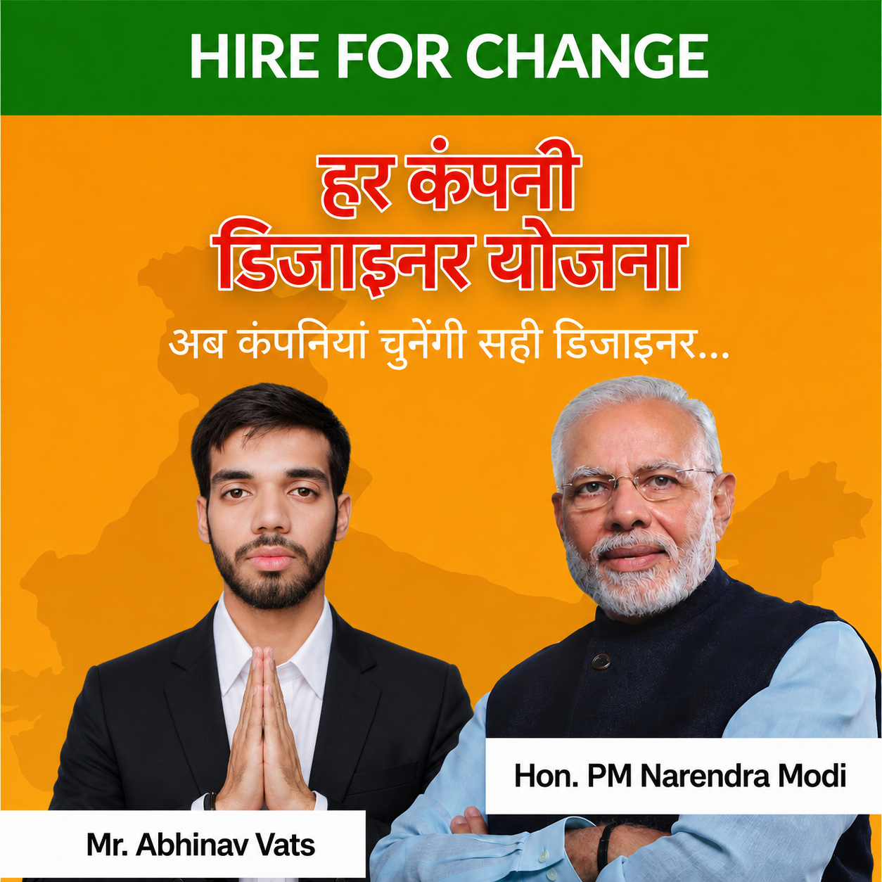
Har Company Designer Yojana
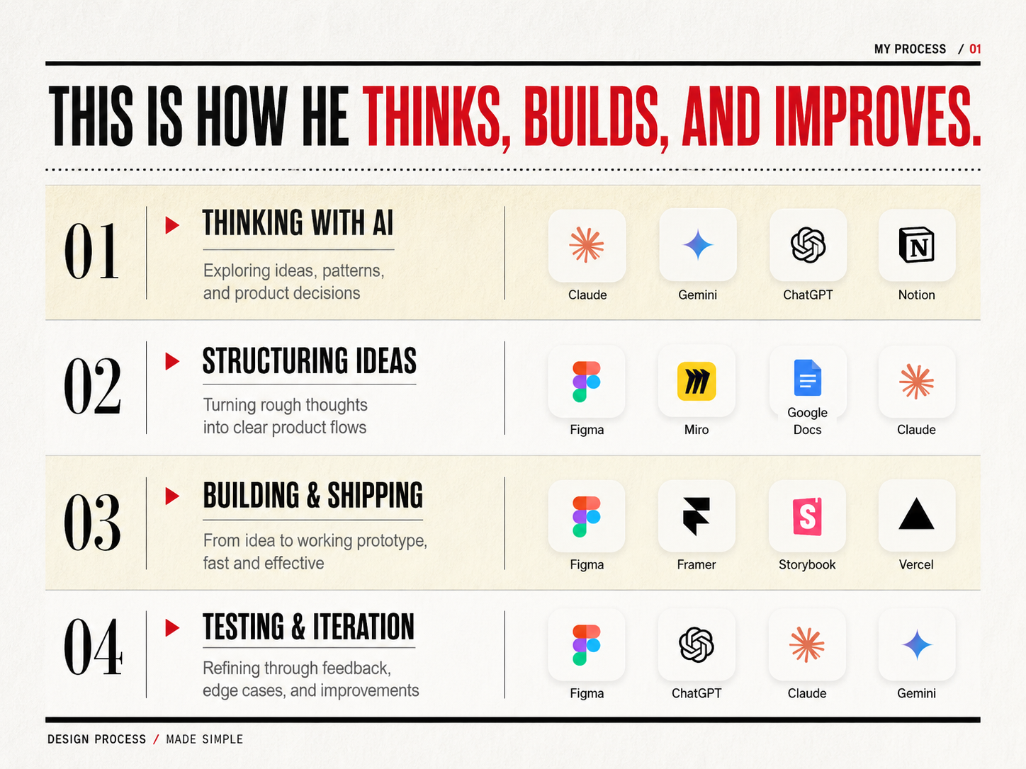
How He Thinks, Builds, and Improves
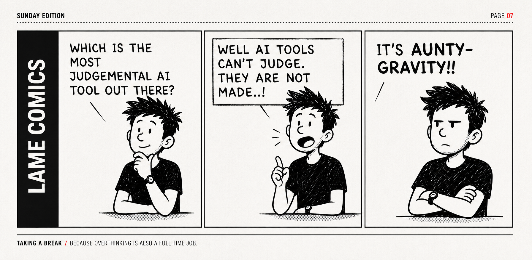
Editorial Comic Corner SPECIAL SECTION
Aunty-gravity Comic

Get to know more of him! :)

Abhinav Vats

UI/UX Designer + Frontend Developer

Selected Design Work 03 Case Studies / Figma

01 Yoruu — AI Dating & Matchmaking
  • Designed a conversation-first mobile dating experience centered around an AI companion, replacing conventional swipe-first discovery with AI-assisted matchmaking.
  • Designed onboarding and the core information architecture for AI-assisted discovery, connecting AI conversation, match suggestions, direct messaging and date planning into one continuous journey.
  • Created the dark-mode visual language using purple and orange accents, rounded conversational components, custom iconography and the signature paw-print interaction.
  • Built high-fidelity screens and interactive prototypes in Figma using Auto Layout to demonstrate the complete mobile experience and key interaction states.
02 Planto — B2B Plant & Eco-Solutions
  • Designed a B2B e-commerce landing page connecting corporate buyers and office spaces with oxygen-rich indoor and outdoor plant setups from local suppliers.
  • Established a nature-first visual hierarchy using deep greens, botanical photography, organic shapes and generous whitespace to communicate workplace wellness immediately.
  • Designed trust-building sections including product categories, customer statistics, testimonials and clear calls to action while maintaining a premium B2B tone.
  • Structured the browsing journey from landing hero to plant categories, product detail and procurement-oriented actions, with a focus on clarity rather than aggressive conversion tactics.
03 Classy Fashion — Luxury Apparel & E-Commerce
  • Designed a mobile-first luxury apparel storefront combining fashion-editorial presentation with practical e-commerce functionality.
  • Created an editorial product presentation system using neutral beige and black tones, generous imagery and minimal product information so photography remained the visual focus.
  • Designed horizontal category filtering, curated browsing, product detail screens, material information and size selection to support fluid product discovery.
  • Designed a streamlined checkout journey while maintaining the restrained visual language and negative space associated with premium fashion experiences.

Experience

UI/UX Frontend Developer Intern — Looping Loons
  • Built and shipped user-facing interfaces for an AI-driven platform, translating product requirements and design concepts into reusable React components.
  • Built 50+ reusable React components, improving UI consistency and reducing feature delivery time by 40%.
  • Collaborated with product, design and QA teams across Agile sprints, contributing to requirement gathering, implementation and release readiness.

Design Capabilities

UI / VisualStrong Creative Sense · Visual Hierarchy · Layout · Typography · Color
UX / ProductWebsite Design · User Flows · Information Architecture · Problem Framing
InteractionFigma Prototyping · Interaction Design · Micro-interactions · User Journeys
Design SystemsComponents · Auto Layout · Design Tokens · Reusable Patterns
Expanding SkillsStrong 2D UI/UX foundation with active openness to 3D & Product Mockups
DeliveryHigh-Fidelity UI · Developer Handoff · Design QA · Agile Collaboration

Tools: Figma · FigJam · Framer · Adobe Creative Suite (expanding) · React · HTML/CSS

Technical Edge

FrontendReact.js · Next.js · TypeScript · Component Architecture
WebHTML · CSS · Tailwind CSS · Responsive Interfaces
WorkflowAgile · Scrum · Git · GitHub · Postman · VS Code
Backend & Data (Secondary)Node.js · Express.js · PostgreSQL · MongoDB · REST APIs

Education

SRM Institute of Science and Technology

B.Tech in Computer Science and Engineering

Certifications

  • AWS Certified AI Practitioner
  • Oracle Agentic AI Certified Foundations Associate

Write to
the Editor.

Open for new opportunities, collaborations, and conversations about design and frontend development. Let's build something meaningful.

THE ABHINAV VATS EDITION · ISSUE 01 · 2026 · NEW DELHI, INDIA

abhinavvats.dev@gmail.com · linkedin.com/in/abhinav-vats25